How Designer André Cândido Is Setting Up SuperHi's Brand for Scale
The #Hi_IMadeIt series features the work and stories of creatives from all over the world as we dig into what it really takes to make something and bring it to life on the internet. Submit your own on Instagram—share your design or code project, tag us @hisuperhi and include the hashtag #Hi_IMadeIt for a chance to be featured. Today, we chat to SuperHi's own designer and art director André Cândido on his creative process as he worked through SuperHi's brand refresh, how he approaches design problems and why thinking in systems matters when building for scale.
My name is André (@andrefrcandido). I’m a designer and art director at SuperHi. I’m a board game player and I’m also an avid reader of independent magazines. I came from a small town and moved to Lisbon, where I studied communication design at the Faculty of Fine Arts. The program there was very research heavy, so I think that influences my approach today as a designer, which is also very research focused.
I think my upbringing is very relevant for the way I approach work now. Because my parents are very restless, they are always doing something. They work on agriculture, on the fields. They can be harvesting almonds, or olives, or harvesting cork from Oak trees. So I think that’s very telling, because they do so many different jobs to survive, to have a salary at the end of the month. They needed to learn how to do all these different types of jobs, because they change depending on the season of the year.
That’s also how I try to approach my design practice, trying to do a lot of different things, and experiment on a lot of tangent fields, to always have something that I can resort to, if some things fail.
Can you talk a little bit about what you’ve done at SuperHi and what your role is? What types of projects have you worked on?
I came to SuperHi as a designer, and now my role has evolved into an art direction role as well. There are two main aspects to my role. So one is maintaining SuperHi visual standards, using the correct typography and colors, and making sure that nothing slips. There’s that curatorial side of the role, but there’s also a more conceptual side, where I come up with ideas for campaigns, initiatives, new courses, or course projects.
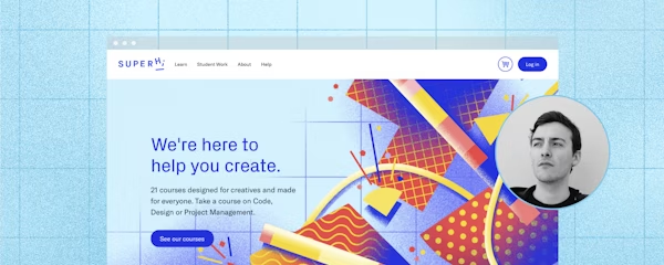
I know that you have been working on a lot of things, with the new site that’s launching, including the course images. That was a huge project. Could you talk about that project, and how that came to be, and why that decision was made, to change the direction of the course images?
SuperHi needed a new website, because there were a lot of processes and features that needed to be updated and optimized on the current one. So, when we decided to launch a new one, I think one of the paramount decisions was: do we keep the same style and vision that we have on the current website? Or do we develop something new?
I wanted to propose a new visuality, because the current one, the way we represent SuperHi courses, is a bit mixed and confusing. Some of the courses are represented by photography, some of them are by illustration, and there’s not a clear boundary where each of these styles fit.
So it seems a bit arbitrary, like what courses are photography, what courses are illustrations? And also visually, the photography and illustrations communicate different things, so they’re not clearly aligned within a vision. It was obvious to me that we needed a new system, and new visuality to it. At the time, the design team at SuperHi was just me, so I was ultimately responsible for that mammoth task of proposing a new way to visualize our courses.
I start almost every single project by researching other brands, and what other things are out there. I remember reading a lot, about the people who did the re-brands of Airbnb, Figma, Dropbox, Adobe, Intercom, Mailchimp, all these brands that have rebranded fairly recently. So, I was reading a lot of these case studies, just to see what were the components that led to that system, why they did those kinds of visuals the way they did, what were the methaphors and the concepts they explored.
I also discovered a podcast by Mark Grambau called How to Draw a Startup. It explores illustration in startups, how those illustrations are crafted and how those illustrators fit into the creative teams. That podcast was very influential in giving me a lot of different perspectives and also names that I could google and find out more about.
Planning of color palettes and shapes for each course in relation to one another. Special attention was taken for courses that are frequently bundled together to not have the same color palette.
I also did a brand audit of the current SuperHi brand. There was a consensus to move away from our current theme of using plain backgrounds with sprinkled abstract shapes. I read an article about “blanding” on Bloomberg, where they featured a lot of different startups that were exactly the same in terms of their business model, look and feel and tone of voice.
So there was a conscious decision to move away from that generic visual style. Because again, we were starting to blend with other brands, and things were starting to feel not so distinctive anymore. I think one thing that I also thought about was, of all the things that we have, what do we want to retain? I decided to retain the shapes, but add more shapes to the roster of possibilities, to retain the colors, but also explore all of the other tones of our color palettes, because the visuality before was just the five main colors, and not really using the tints or the shades.
I started to open the palette more, and use it more effectively, while working to retain the fun and approachable style that we are already known for, because a lot of our community members come to us for this. One thing that also went into consideration is how diverse the community of SuperHi is. Our current students are 57% female, 3% non-binary, and 40% male. They come from a different range of backgrounds, so it was very important that our identity was reflective of that. It was important that our visual language was as diverse as possible.
I definitely see that thought, and that planning, and how it all ties into the vision and the evolution of SuperHi as a brand. Could you talk a little bit about getting into, actually, the specifics of the brand system or the visual system, that you’ve created? What do the shapes, and the grids, and the colors, what does it all mean and how did you work that out?
So for context, plans for the future of SuperHi are to expand our roster of courses. That made it very evident that whatever I proposed for the course images, there would need to be an underlying system that would allow us to build more images as we launch more courses, in an efficient way.
When you’re playing for scale, a system is fundamental.
What I started doing was analyze the current courses that we have and what they have in common. So, I started by weighing all our courses in a two-axis grid. In one of the axes were the topics of our current courses, and those are code, design, and project management. And on the opposite axis, we had the difficulty level of the courses. So currently, we have beginner, intermediate, and advanced courses.
All current courses and future courses will fit into this grid. And even if we have a course in a new topic that is not code, design, or project management, we can always add a new column to that grid, and whatever the topic that course is, it will also have a corresponding level of difficulty. So, dividing courses by difficulty level and topic seemed like something that all courses would definitely have in common.
And then, what I started to do was try to create layers of meaning for the images. I went with a different kind of grid to represent the different topic of that course. We have a square grid for code courses, and we have a dot grid for design courses, and we have a line grid for the project management course.
Then, what I played was with the density of the grid, to represent the level of difficulty. So, if the grid is more airy and big, the course is a beginner level. And if the grid is more dense, the course is an advanced course. And you can see that clearly, when you have all images side by side, you can almost play a game of, where does this course fit in these grids?
The underlying grid that is the base layer to pin each course.
Because we have five main colors, I tried to experiment with how the colors could behave in this system. After many tries, I decided that the maximum number of colors per image would need to be three, because if there were more, the images start to get confusing, and they start to blend together. The three-color palette was the sweet spot.
When you are creating a system, for me, it’s almost like playing a game, where I’m creating the rules, but I’m also playing the game to win it. So at the same time, I know that every time I create a rule, it will constrain the results. But on the designer side, I’m also trying to play and break the rule, to make each image different while coming from the same place.
Then I added the shapes. There’s a very conscious decision as well, about their quantity and scale on the course image. So, if there are fewer in number and larger in scale, it’s a beginner course. And the idea is that the image is more airy and approachable.
So for our beginner courses, all of them have three big shapes, and we add one more shape to intermediate courses. And we add even more shapes to our advanced courses, where we have six. So the ultimate goal is that the more advanced the course, the busier and denser the images are. And the beginner courses are much more airy and light.
The third layer of the images are fun decorative elements, and these are abstractions of progress bars or paper clippings. All of those are very telling of my references and ideas; even if they are very abstract, they contribute to the layers of meaning in the final product.
That’s really fascinating! I really enjoyed hearing that whole process. Could you talk a little bit about, if there’s anything that you learned about this project, about your creative process, or something that was just different from how you’ve approached things in the past? Was there anything that was difficult, or challenging?
The project was very challenging, and I started it as I start all projects, very fearful and doubting of myself and my capacities, because it was such a huge project. And I know that the brand of SuperHi is very cherished by their users, and that was very evident: when we put a job ad for a graphic designer, we received thousands of applications all saying like, “We love your brand.” That’s when you know that you are touching something that is very special.
It’s always with fear that you approach a project like this. But I also wanted to give it a cohesive vision. That would be the main thing that I took from this project. I felt the need to learn things that I did not know before. I wanted to explore grains and gradients because they would culminate in a much warmer and textured image. I’ve never used those tools before.
But I really wanted to go there because I think it’s also a nod to the history of the web, and the early bitmap graphics. I’m thinking about the icons by Susan Kare and all the early web games that were very pixellated. I knew that I wanted to also put this system in a historical context, and have it be influenced by design history roots. Even in the way that the company is named, “SuperHi”, because of the information “superhigh”-way, is very telling of our approach here. So I also wanted that nod to the past to be visible.
I’ve never illustrated before. I grew up drawing, but I’ve never done it in a professional capacity. It threw me completely out of my comfort zone. But I think I benefit from it.
I benefit from the openness to learn new tools, and master new techniques. And in that uneasiness, you also discover new ways to do things. The accident can be really beautiful.
You mentioned it before, you’re never working on one thing, one project at a time. Could you talk about how you balance all your different projects at SuperHi?
Until very recently, I was the only designer on the team, so every task that needed design assistance would fall under my plate of stuff to do. It was difficult. I think I usually have a bit of a head start, because of the time zone difference on our team. So my mornings are usually quiet, and are perfect for making progress on work. But usually, because I’m involved in so many projects at SuperHi, my afternoons are filled with meetings, and different project check-ins.
It was very hard to manage. But it was a massive help, prioritizing some projects in relation to others, and also to ask for external help on other projects. So I’ve been art directing some projects, that I’m not the designer of, and we are collaborating with external designers, because I simply didn’t have the time to do it.
And also, there’s other things that I usually do, for example, giving feedback to our students on our Visual Design + Branding course. I’ve delegated that task to another team member, Brian and now Arianna is helping out with that too. So, I think the way to manage all of these was through prioritization, delegation, and collaboration.
The three layers of the Foundation HTML, CSS + Javascript course image.
What’s your stack? What are the tools you used for this project specifically?
For research, I use Pinterest a lot. And I use Notion to document everything, but that’s also because that’s how SuperHi documents everything. So, I just use the tools that we have here. For creating the graphics, I usually work in Figma, but for this project, because we needed to use gradients heavily, I really need to be able to manipulate gradients in a very specific way that Figma does not allow yet. So the images were all done in Adobe Illustrator.
And then for the web design of the actual project, we collaborated with an external product designer, James Shedden. We collaborated in Figma, where he was designing the website, and I was doing the illustrations at the same time.
So, congrats on completing the course images and to the entire team on the launch of the new marketing site, I know it was a team effort. I would love to know, from your perspective, what’s next, from both the angle of SuperHi’s visual direction, and also, what’s next for you as a designer, personally?
I’m very eager to roll this brand identity out across all touch points. We have some projects in the physical world with our welcome pack boxes and our book. We are very heavily also in the digital sphere of course, with social networks and paid ads. So I’m very eager to just roll the brand visuals out to all these different platforms and different use cases. And also trying to think of how to adapt it, and how to evolve it even further, because I think we’re not done yet. This was just the beginning.
For every new project, we need to assess how the brand identity can be present here, and how we can push it further so we can continue with it. We add to it, because I think we need that diversity, and to keep evolving it over time. So, that’s also very exciting to work on, and to think about.
For me personally, right now, I don’t really have a plan as of the moment. Recently, I was promoted to an art director role at SuperHi. So, I’m just embracing all the responsibilities that entails. I’m also starting to create my little design team at SuperHi, so that’s very exciting.
-As told to Ana Wang, September 2020
Ana Wang was previously the Head of Content at SuperHi. She is an ex fashion designer and copywriter who ran a whole bunch of ecommerce stores and brands and then helped other people run ecommerce stores, then helped other people help other people run ecommerce stores. Now, she's a creative generalist who plays with different mediums to tell stories.